Visualisers
Each visualiser renders one figure per call. All of them are declared per-assessor in YAML:
robustness:
  marabou:
    _target_: "MarabouAssessor"
    visualisers:
      - _target_: "OutputBoundsCohortVisualiser"
      - _target_: "OutputBoundsMarginHeatmapVisualiser"
from raitap.robustness import marabou, output_bounds_cohort, output_bounds_margin_heatmap

robustness = {
    "marabou": marabou(
        visualisers=[output_bounds_cohort(), output_bounds_margin_heatmap()],
    ),
}
Visualisers declare which AssessmentKind they support; the factory rejects mismatches at YAML parse time.
Empirical attack
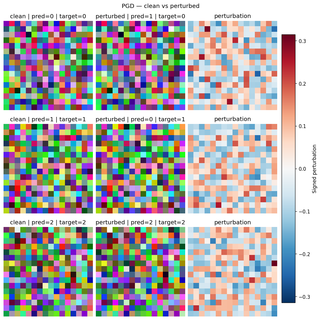
ImagePairVisualiser
Renders the first few samples as three side-by-side panels — clean input, perturbed input, and a signed perturbation heatmap — so you can eyeball whether the attack produced a visually plausible counter-example or just noise. Use it as the default first-pass sanity check for any image-modality attack run.
How to read it. Each row is one sample; the three columns left→right are the clean input, the perturbed (adversarial) input, and their signed difference. In the difference panel red/blue marks the per-pixel perturbation direction on the dominant channel and white means untouched. Structure that traces the object means a directed attack; uniform speckle means an undirected one.
Kwarg |
Default |
Meaning |
|---|---|---|
|
|
Maximum number of rows (samples) to render. |
|
|
Diverging colormap used for the signed perturbation panel. |
|
|
Fixed symmetric vmin/vmax for the perturbation panel. |
Supports AssessmentKind.EMPIRICAL_ATTACK. Rejects non-image results (InputSpec.kind != IMAGE).
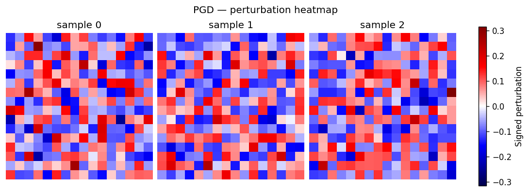
PerturbationHeatmapVisualiser
Per-sample diverging heatmap of the perturbation only. Useful when you do not need the clean / perturbed comparison and want a denser grid focused on the attack's spatial signature.
How to read it. One panel per sample; colour is the perturbation reduced to a signed scalar per pixel (red/blue = + / − direction, white = untouched) and brightness is magnitude. It is the signed-difference column of the image-pair view on its own. The default reduction (signed_dominant) keeps the signed value of the channel with the largest absolute deviation, so red/blue track the attack's direction instead of cancelling to zero on opposing channels.
Kwarg |
Allowed |
Default |
Meaning |
|---|---|---|---|
|
— |
|
Maximum number of samples to render. |
|
— |
|
Diverging colormap for the perturbation. |
|
|
|
Per-pixel channel reduction applied before colouring. |
Supports AssessmentKind.EMPIRICAL_ATTACK. Rejects non-image results.
Formal verification
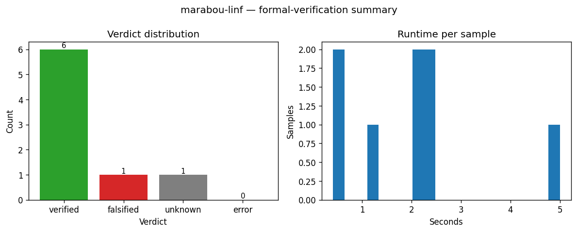
VerdictSummaryVisualiser
Two-panel summary of a verifier batch: a bar chart of per-verdict counts plus a histogram of runtime_per_sample. Use it as the first thing you look at after a verifier run to see how it performed before drilling into bound widths.
How to read it. Left panel — bar height is the number of samples per verdict (VERIFIED / FALSIFIED / UNKNOWN / ERROR); a tall VERIFIED bar means a robust batch. Right panel — x is per-sample verifier runtime in seconds, y is sample count; a long right tail flags samples the verifier struggled on.
Kwarg |
Default |
Meaning |
|---|---|---|
|
|
Histogram bin count for the runtime panel. |
Supports AssessmentKind.FORMAL_VERIFICATION.
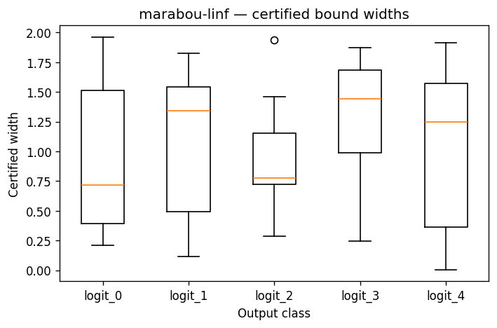
OutputBoundsCohortVisualiser
One boxplot per output class summarising the certified upper[i, k] - lower[i, k] widths across the verified batch. Reach for it when you want a single figure that says "class k's certified region is tight for most samples but has a long tail at logit 3".
How to read it. The x-axis is the output class k; each box summarises the certified interval width (upper − lower) over the batch for that class. Lower, tighter boxes mean more confident bounds; a long upper whisker or tail means a few samples have loose bounds on that class. Width is uncertainty, not correctness — a wide box does not mean the class is wrong, only that the verifier could not pin its logit tightly.
Kwarg |
Default |
Meaning |
|---|---|---|
|
|
Matplotlib whisker length (multiple of IQR). |
|
|
Whether to render flier points beyond the whiskers. |
Supports AssessmentKind.FORMAL_VERIFICATION. Renders a placeholder figure when result.output_bounds is None or every row is NaN.
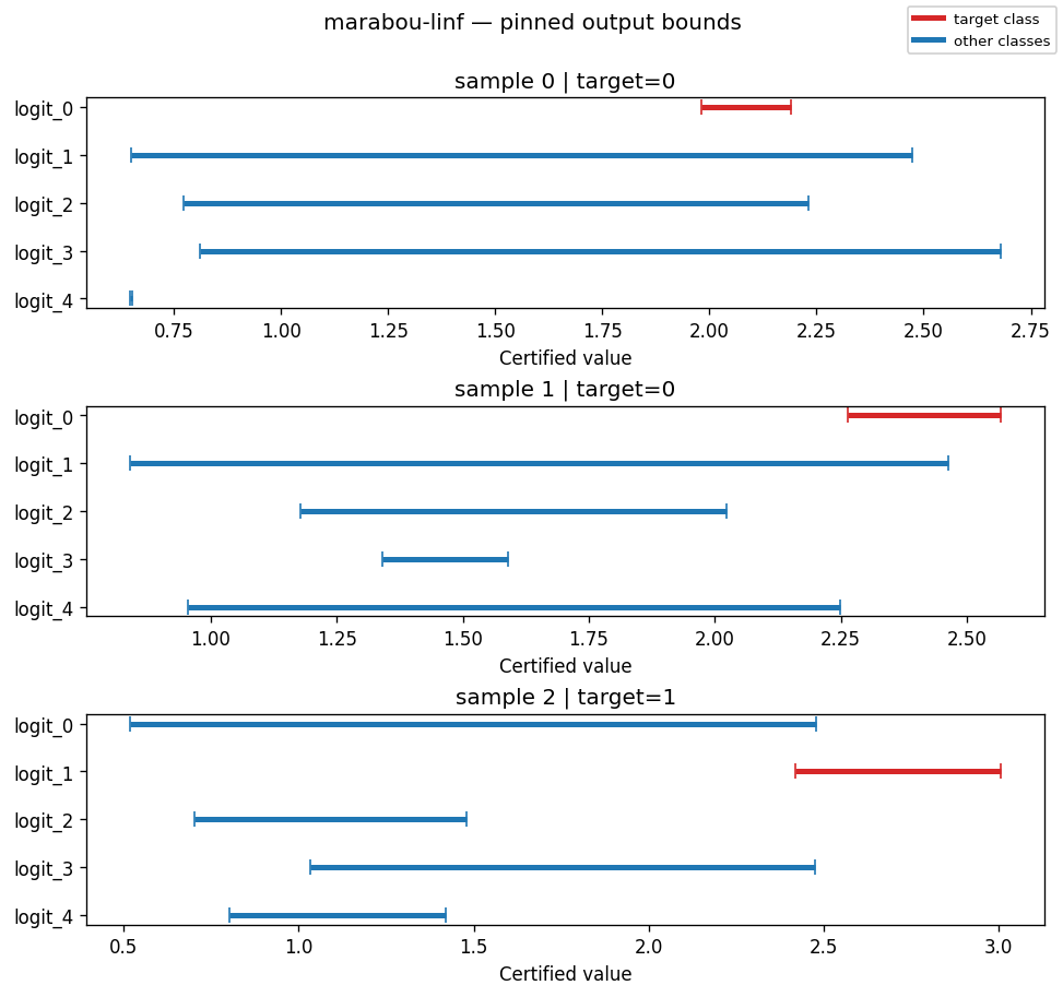
OutputBoundsPinnedVisualiser
One sub-plot per pinned (or first-finite) sample, showing the certified [lower_k, upper_k] interval for each output class with the target class highlighted. Use it to examine specific samples by index — e.g. "what does the bound for sample 17 look like?"
How to read it. The x-axis (certified value) is the range each class's logit can take under any perturbation inside the budget; each bar spans [lower_k, upper_k]. The target class is red, competitors blue. A sample is VERIFIED exactly when the red bar lies entirely to the right of every blue bar — the target's certified lower bound exceeds every competitor's certified upper bound, so no input in the budget can change the top class. Any overlap means the bound cannot rule out a competitor overtaking the target → UNKNOWN (bound propagation is sound but incomplete, so it never reports FALSIFIED).
Kwarg |
Default |
Meaning |
|---|---|---|
|
|
Maximum number of samples when |
|
|
Maximum classes drawn per sub-plot. Above it, shows the target plus the classes with the largest certified upper bounds (the closest competitors), so many-class models like ImageNet stay legible instead of collapsing into a wall of rows. |
|
|
Bar colour for the target class. |
|
|
Bar colour for non-target classes. |
|
|
Optional explicit list of row indices to pin. |
Supports AssessmentKind.FORMAL_VERIFICATION. Falls back to a placeholder when bounds are absent.
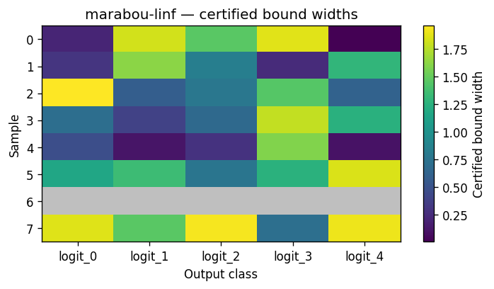
OutputBoundsWidthHeatmapVisualiser
A samples-by-classes heatmap whose cell value is the certified width upper - lower. Pick this over the cohort boxplot when batch size is small enough that per-sample visibility is more useful than per-class aggregate stats.
How to read it. Rows are samples, columns are classes; cell colour is the certified width (upper − lower) — brighter per the colormap means a wider, looser bound. Grey cells are NaN rows (FALSIFIED / UNKNOWN / ERROR) with no bound, so the grey pattern doubles as a coverage map of which samples the verifier actually certified.
Kwarg |
Default |
Meaning |
|---|---|---|
|
|
Sequential colormap for widths. |
|
|
Truncate to the first N rows. |
|
|
Manual override; |
Supports AssessmentKind.FORMAL_VERIFICATION.
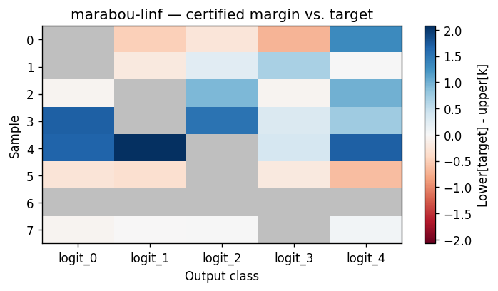
OutputBoundsMarginHeatmapVisualiser
A samples-by-classes heatmap of the per-class certified margin against the target class. Use it for "is this batch robustly classified, or merely verified-with-room-to-flip?"
How to read it. Rows are samples, columns are classes; each cell is margin[i, k] = lower[i, target_i] - upper[i, k]. Blue (positive) means the target class is provably above class k everywhere in the certified region; red (negative) means class k could overtake the target — a flip risk. An all-blue row is comfortably robust; any red cell is where robustness is not certified. The target's own column is masked grey.
Kwarg |
Default |
Meaning |
|---|---|---|
|
|
Diverging colormap. |
|
|
Truncate to the first N rows. |
|
|
Manual override; |
Supports AssessmentKind.FORMAL_VERIFICATION. Falls back to a placeholder when result.targets is missing or shaped wrong.
Statistical sampling
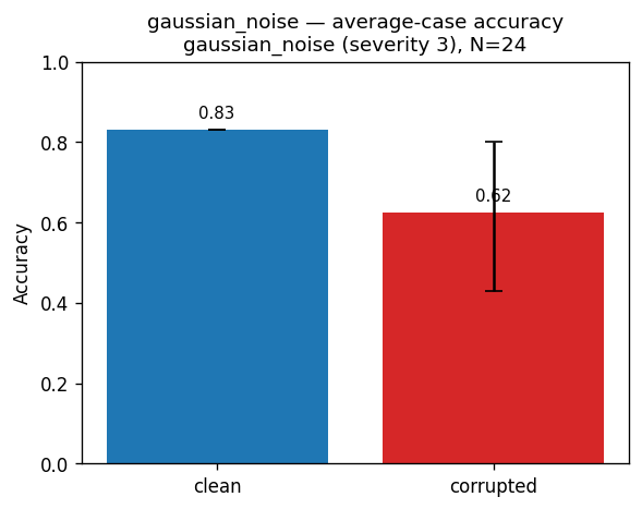
CorruptionAccuracyVisualiser
Clean vs corrupted accuracy bars with a CI whisker on the corrupted bar. Use it to see at a glance whether a corruption degrades accuracy and how tight the estimate is.
How to read it. Two bars — clean accuracy vs accuracy under the corruption; the whisker on the corrupted bar is its confidence interval. A big drop means the corruption hurts; a wide whisker means few samples, so treat the estimate cautiously. Annotated with the corruption name, severity, and sample count (N).
Supports AssessmentKind.STATISTICAL_SAMPLING. No image-modality requirement. Renders as an assessor-level figure (one chart for the whole assessment) rather than per-sample.