Visualisers
Each visualiser renders one figure per call. All of them are declared per-explainer in YAML:
transparency:
  captum_ig:
    _target_: "CaptumExplainer"
    algorithm: "IntegratedGradients"
    visualisers:
      - _target_: "CaptumImageVisualiser"
      - _target_: "TabularBarChartVisualiser"
from raitap.transparency import captum, captum_image, tabular_bar_chart

transparency = {
    "captum_ig": captum(
        algorithm="IntegratedGradients",
        visualisers=[captum_image(), tabular_bar_chart()],
    ),
}
Visualisers declare which ExplanationScope, output space, and method families they support;
the factory rejects mismatches at YAML parse time. See
Supported libraries for the at-a-glance compatibility table and
Contributing to the transparency module for the underlying contract.
Captum
CaptumImageVisualiser
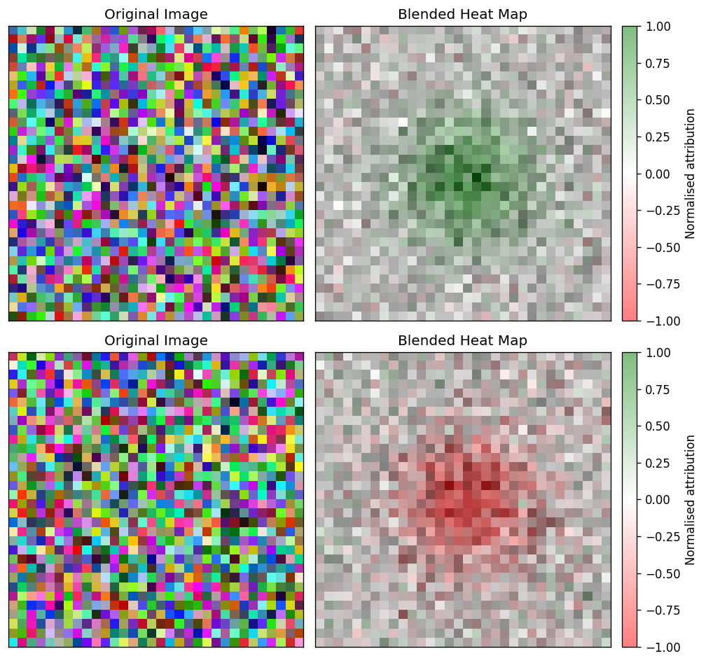
Side-by-side panels — original image on the left, attribution overlay on the right — for each sample in the batch. Use it as the default first-pass figure whenever the explainer produces pixel-level or spatial-map attributions on image inputs.
How to read it. Per sample, two panels: the original image and the attribution overlay. Warm regions are pixels that pushed the prediction toward the explained class, cool regions push against it (controlled by sign), and brightness is attribution strength — read it as "where the model looked". The method kwarg picks the render mode (blended heatmap, bare heatmap, masked image, …).
Wraps captum.attr.visualization.visualize_image_attr.
Kwarg |
Allowed |
Default |
Meaning |
|---|---|---|---|
|
|
|
Captum render mode. |
|
|
|
Which contributions to show. |
|
— |
|
Whether to add a colorbar next to the attribution panel. |
|
— |
|
Optional attribution panel title forwarded to Captum. |
|
— |
|
Render the original image next to the attribution panel when |
Layer-based methods (LayerGradCam, LayerActivation, …) emit attribution maps at the chosen layer's spatial resolution (e.g. 7×7 for ResNet-18 layer4 with 224×224 inputs). When inputs are provided, the visualiser bilinearly upsamples such maps to the original image size before rendering so the overlay aligns with the input extent — applied for every method except original_image. The map still snaps to the layer's cell grid — intrinsic to Grad-CAM, not a visualiser artefact. For tighter localisation, use a shallower layer (e.g. layer3 → 14×14) or a pixel-space method (Saliency, IntegratedGradients, GuidedGradCam).
Scope: LOCAL. Output spaces: INPUT_FEATURES, IMAGE_SPATIAL_MAP. Method families: GRADIENT, PERTURBATION, SHAPLEY, CAM, MODEL_AGNOSTIC, SURROGATE. Requires explicit image input metadata (InputKind.IMAGE) and an NCHW-compatible attribution shape; rejects tabular, token, and time-series layouts.
CaptumTimeSeriesVisualiser
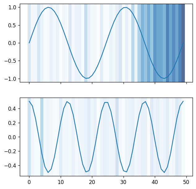
Overlay of per-channel attribution magnitudes on top of the raw time-series signal. Pick this when the explainer ran on (T, C) channels-last inputs and you want to see when in the sequence the model focused.
How to read it. The x-axis is the sequence position (time); the raw signal is drawn per channel with the per-step attribution magnitude overlaid as colour/intensity, so the bright stretches mark when in the sequence the model focused. The method kwarg switches between overlaying channels individually, combined, or as a coloured graph.
Wraps captum.attr.visualization.visualize_timeseries_attr.
Kwarg |
Allowed |
Default |
Meaning |
|---|---|---|---|
|
|
|
Overlay render mode. |
|
|
|
Which contributions to show. |
Scope: LOCAL. Output space: INPUT_FEATURES. Requires InputKind.TIME_SERIES metadata and (B, T, C) or (T, C) attribution layouts. The inputs argument (the original time series) is mandatory — attributions alone are not enough to render the overlay.
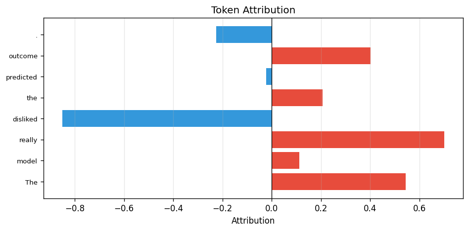
CaptumTextVisualiser
Horizontal bar chart of per-token attribution scores. Positive contributions render in warm red, negative in cool blue, so you can read off which tokens pushed the prediction in which direction at a glance.
How to read it. One horizontal bar per token, in token order top-to-bottom; bar length is the token's attribution magnitude, warm red means it pushed the prediction up and cool blue means down. Scan it to see which words drove the call.
Wraps a lightweight Matplotlib renderer (Captum's native text visualiser emits HTML rather than a Matplotlib figure).
Kwarg |
Default |
Meaning |
|---|---|---|
|
|
Per-token strings used as y-axis labels. Falls back to |
Scope: LOCAL. Output space: TOKEN_SEQUENCE. Requires text input metadata and a 1-D token attribution tensor with the TOKENS / TOKEN_SEQUENCE layout.
SHAP
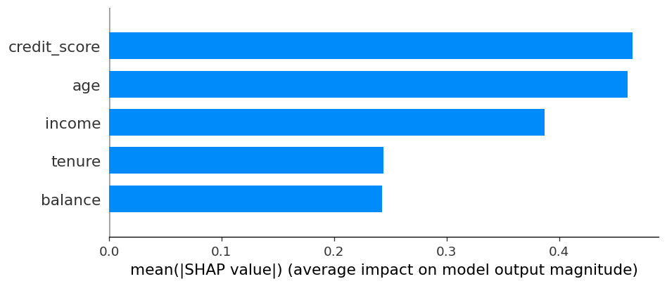
ShapBarVisualiser
Mean-absolute-attribution bar chart across the selected batch, one bar per input feature. Use it as the headline "what matters on average?" figure for any tabular or interpretable-features explanation.
How to read it. One bar per feature, length is the mean absolute SHAP value across the batch — the sign-agnostic "how much does this feature matter on average". Bars are sorted by importance and the top max_display are shown; it answers which features, not which direction.
Wraps shap.summary_plot(plot_type="bar").
Kwarg |
Default |
Meaning |
|---|---|---|
|
|
Optional list of feature labels. Falls back to SHAP's |
|
|
Maximum number of features to render. |
Scope: LOCAL (consumes local attributions). Produces an aggregated visual summary so reporting places the figure under aggregated explanations. Output spaces: INPUT_FEATURES, INTERPRETABLE_FEATURES. Method family: SHAPLEY. Requires (B, F) tabular or interpretable attributions.
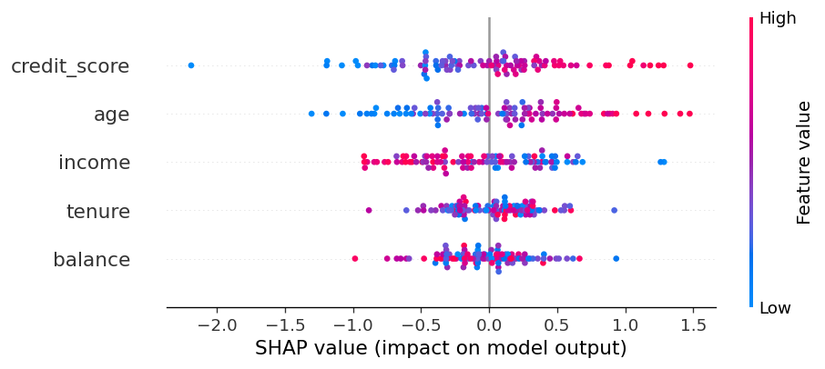
ShapBeeswarmVisualiser
SHAP beeswarm — one dot per sample per feature, coloured by the feature value, positioned by the SHAP score. Reach for it when the bar chart hides distributional information you care about (e.g. "income matters, but only when it is high").
How to read it. One row per feature (most important on top), one dot per sample placed by its SHAP score on the x-axis (left pushes the output down, right up) and coloured by the feature's value (red high, blue low). Horizontal spread shows the distribution of effects; a red→blue gradient along x tells you whether high feature values push the prediction up or down.
Wraps shap.summary_plot() (default plot_type="dot").
Kwarg |
Default |
Meaning |
|---|---|---|
|
|
Optional list of feature labels. |
|
|
Maximum number of features to render. |
Scope: LOCAL consumed, aggregated visual summary produced. Output spaces: INPUT_FEATURES, INTERPRETABLE_FEATURES. Method family: SHAPLEY. Requires (B, F) tabular or interpretable attributions; passing inputs unlocks the colour-by-feature-value channel.
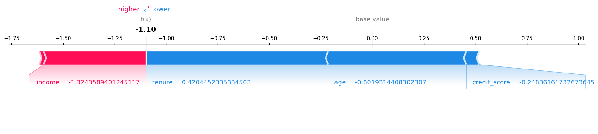
ShapWaterfallVisualiser
Per-sample waterfall chart: starts at the baseline expected_value and walks through each feature's contribution to reach the model output. Pick a single sample with sample_index when you want to explain a specific prediction end-to-end.
How to read it. For one sample, bars start at the baseline expected_value at the bottom and stack each feature's signed contribution (red pushes the output up, blue down) to land on the final model output at the top. Read it bottom-to-top as the step-by-step account of one prediction.
Wraps shap.plots.waterfall.
Kwarg |
Default |
Meaning |
|---|---|---|
|
|
Optional list of feature labels. |
|
|
Model baseline ( |
|
|
Which row of the batch to render. |
|
|
Maximum number of features to show before grouping the rest. |
Scope: LOCAL. Requires (B, F) tabular or interpretable attributions.
ShapForceVisualiser
Per-sample force plot showing positive (red) and negative (blue) feature pushes around the baseline. Compact alternative to the waterfall when you need many local explanations side by side rather than one detailed breakdown.
How to read it. For one sample, features push along a horizontal axis around the baseline: red features push the output higher, blue lower, and bar width is the size of each contribution. Where the opposing pushes meet is the final prediction.
Wraps shap.plots.force(matplotlib=True).
Kwarg |
Default |
Meaning |
|---|---|---|
|
|
Optional list of feature labels. |
|
|
Model baseline / SHAP base value. |
|
|
Which row of the batch to render. |
Scope: LOCAL. Requires (B, F) tabular or interpretable attributions. Saved as a PNG via Matplotlib (RAITAP does not use SHAP's HTML force-plot backend).
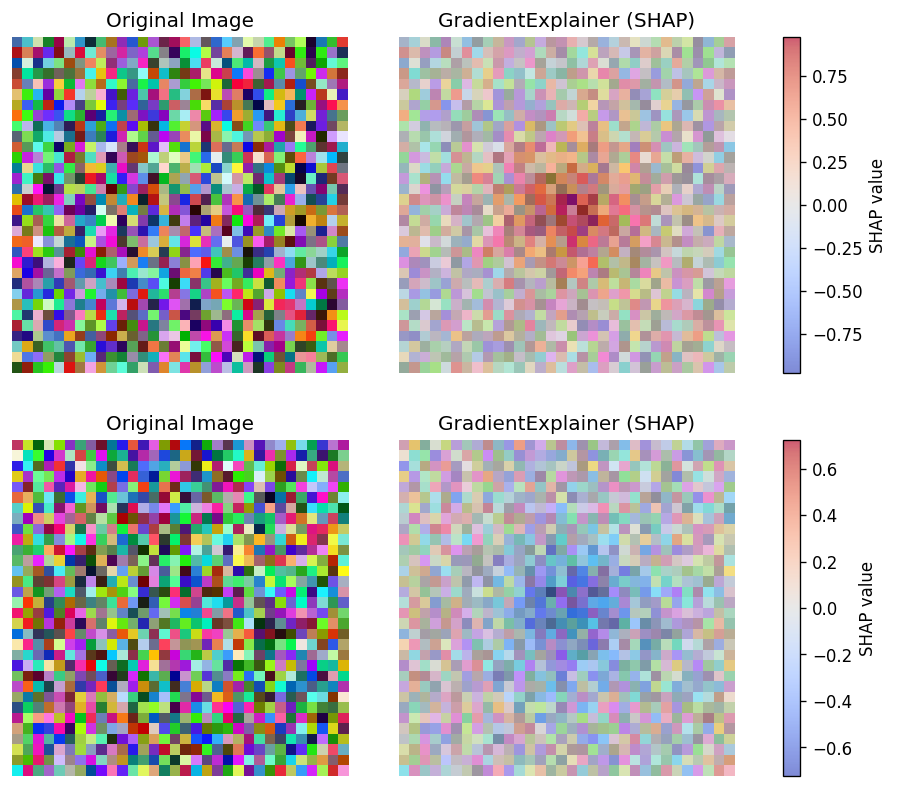
ShapImageVisualiser
Paired-panel renderer for pixel-level SHAP values: original image on the left, channel-summed heatmap overlay on the right. Restricted to GradientExplainer and DeepExplainer — the only SHAP explainers that produce meaningful per-pixel scores.
How to read it. Per sample, the original image and a channel-summed SHAP heatmap. Red pixels raise the explained class's score, blue pixels lower it, and intensity is the magnitude — "which pixels move this class, and in which direction".
Wraps a custom RAITAP Matplotlib renderer (SHAP's native shap.image_plot is not used; this keeps the layout consistent with the other RAITAP image visualisers and adds sample-aware titles and colorbar control).
Kwarg |
Default |
Meaning |
|---|---|---|
|
|
Maximum number of images displayed side by side. |
|
|
Optional attribution-panel title (falls back to algorithm name). |
|
|
Render the original image next to the heatmap. |
|
|
Add a SHAP colorbar in the paired layout. |
|
|
Matplotlib colormap for the heatmap overlay. |
|
|
Alpha for the SHAP heatmap overlay. |
Scope: LOCAL. Output space: INPUT_FEATURES. Method family: GRADIENT. Requires explicit image input metadata and (B, C, H, W) attributions; refuses explanations from non-pixel SHAP explainers such as KernelExplainer or TreeExplainer.
Generic
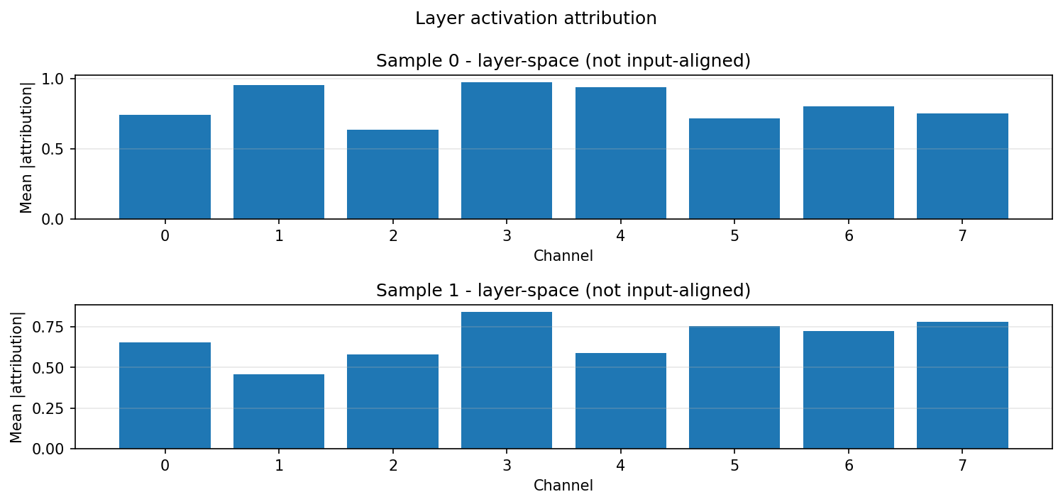
LayerActivationVisualiser
Renders layer-space attributions from captum Layer* methods (LayerConductance, LayerActivation, LayerIntegratedGradients, ...) that align to a hidden layer rather than the input. Use it when you attribute to an internal layer and want a magnitude summary instead of an input-space heatmap.
How to read it. One panel per sample. A convolutional layer (C, H, W) shows one bar per channel (mean absolute attribution); a linear layer (F,) shows one bar per feature; a sequence layer (tokens, hidden) (e.g. a ViT block) shows a magnitude heatmap. Magnitudes only. These are layer attributions, not input-aligned, so do not read them as a pixel heatmap.
Kwarg |
Default |
Meaning |
|---|---|---|
|
|
Maximum number of samples to render (one panel each); larger batches are truncated. |
Scope: LOCAL. Output spaces: LAYER_ACTIVATION only. Payload kind: ATTRIBUTIONS. Pair it with a Layer* captum explainer that sets layer_path.
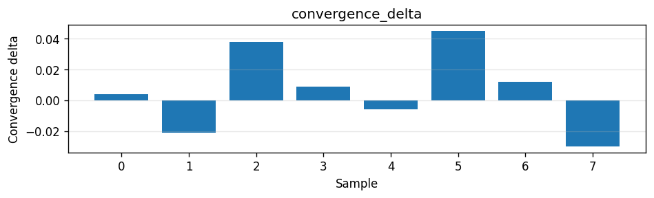
StructuredPayloadSummaryVisualiser
Renders additive structured payloads (Captum convergence deltas, SHAP base values) that an explainer emits alongside the principal attribution. Use it to surface the per-sample diagnostics persisted under payloads/ as a quick bar summary.
How to read it. One bar panel per matching structured payload, one bar per sample along the x-axis with the payload value on the y-axis. For a convergence_delta panel, bars near zero mean the attribution sum closely matched the completeness target for that sample; larger magnitudes flag samples where the approximation drifted.
Scope: LOCAL. Payload kind: ATTRIBUTIONS. Structured payload kinds: convergence_delta, base_value. Reads VisualisationContext.structured_payloads; renders only payloads whose kind it declares. Any-of: it is compatible as long as the explanation carries at least one declared kind (an IG run supplies convergence_delta, a modern SHAP run supplies base_value), so attach it to an explainer that emits a structured payload.
transparency:
  ig:
    _target_: CaptumExplainer
    algorithm: IntegratedGradients
    call:
      target: 0
      return_convergence_delta: true   # emits the convergence_delta payload
    visualisers:
      - _target_: StructuredPayloadSummaryVisualiser
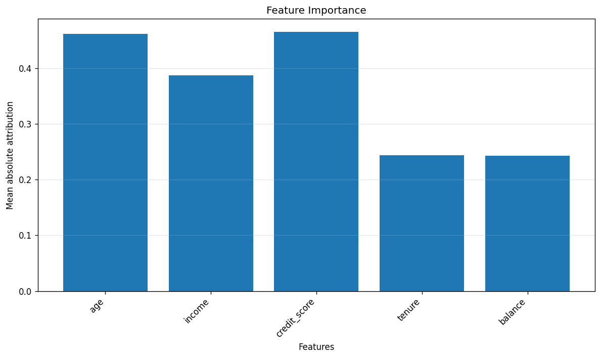
TabularBarChartVisualiser
Framework-agnostic mean-absolute-attribution bar chart for tabular features. Use it when the explainer is Captum (or anything else) rather than SHAP and you still want the same "what matters on average?" aggregated summary.
How to read it. One bar per feature, length is the mean absolute attribution across the batch — the framework-agnostic "what matters on average" for non-SHAP explainers, sorted by importance. Magnitude only, no direction.
Wraps a small Matplotlib renderer (no third-party plotting dependency).
Kwarg |
Default |
Meaning |
|---|---|---|
|
|
List of feature names for x-axis labels. |
Scope: LOCAL consumed, aggregated visual summary produced. Output spaces: INPUT_FEATURES, INTERPRETABLE_FEATURES. All method families are accepted. Requires (B, F) tabular attributions; rejects image, text, and time-series modalities.
Detection
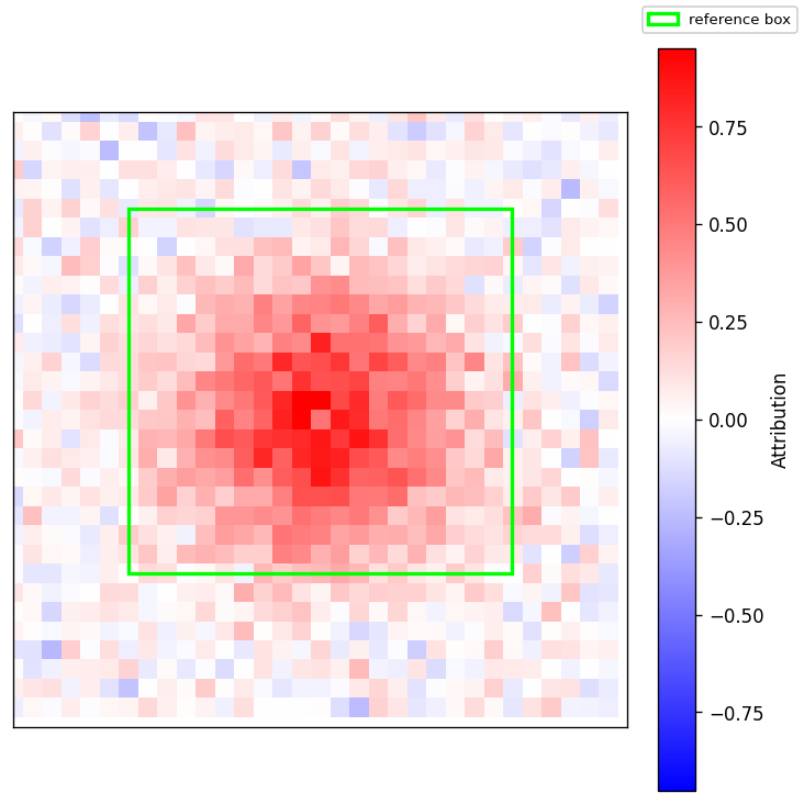
DetectionImageVisualiser
Renders one figure per detected box for any backend whose task_kind == detection (torchvision Faster R-CNN / RetinaNet / SSD). Each figure shows the original image with the reference bounding box outlined and the per-pixel attribution heatmap overlaid.
How to read it. One figure per detected box: the original image with that detection's reference box outlined and the per-pixel attribution heatmap overlaid — warm pixels are the evidence supporting that box. The title carries the label name (or class N), the detection score, and the display/raw box index pair for provenance.
Kwarg |
Allowed |
Default |
Meaning |
|---|---|---|---|
|
|
|
Overlay render mode. Honoured only for captum-sourced detections; a set value the resolved renderer can't honour emits a |
|
|
|
Which contributions to show. A set value overrides the family-auto sign; an unsupported value emits a |
|
— |
|
Gates the attribution colorbar (renderer-agnostic). Set |
|
— |
|
Sets the report group name for this visualiser's figures (covers issue #225's detection half). Does not change the per-box figure title (label + score + box index). |
Compatible with all attribution method families that produce per-pixel maps (gradient, perturbation, shapley, cam, model-agnostic, surrogate).
transparency:
  my_ig_explainer:
    _target_: CaptumExplainer
    algorithm: IntegratedGradients
    call:
      target: 0                  # required — wrapper exposes one scalar channel
    raitap:
      detection:
        score_threshold: 0.5     # default; drop detections below this
        max_boxes: 5             # default; cap K per sample
        iou_threshold: 0.5       # default; used by reference_match target
    visualisers:
      - _target_: DetectionImageVisualiser
        # all optional; omit for the default figure. Allowed values per kwarg
        # are in the table above.
        method: blended_heat_map
        sign: positive
        show_colorbar: true
        title: "Integrated Gradients"
The pipeline emits one ExplanationResult per detected box (top-K after threshold filtering), each carrying a DetectionBox with the reference xyxy / score / label. Results from the same sample share original_sample_index so reporting groups them visually via the sample-id chip.
Scope: LOCAL. Output space: DETECTION_BOXES. Supported task: detection. Requires VisualisationContext.detection_box to be set (populated automatically by the detection explain phase).
method / sign are honoured only when the resolved renderer supports them —
the renderer is chosen automatically from the attribution's source library, not
configured directly. The captum renderer honours both; the house renderer
honours only sign all/positive; the SHAP renderer honours neither. When
you set a method/sign the resolved renderer can't honour, raitap emits a
UserWarning naming the field and source library instead of silently ignoring
it. show_colorbar is renderer-agnostic (it gates the figure's attribution
colorbar directly), so it applies regardless of source library.
Reporting helpers
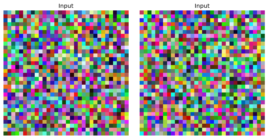
InputThumbnailVisualiser
Compact preview of the original input, used by the report builder to render one shared sample thumbnail in sample-header rows (not a typical user-configured visualiser). Image inputs only; falls back gracefully when no compatible input is available.
How to read it. Just a thumbnail of the original input — no attribution overlay. The report uses it to anchor each sample row visually so the explanation figures below it have a reference image.
Kwarg |
Default |
Meaning |
|---|---|---|
|
|
Caption shown above the thumbnail. |
|
|
Maximum number of thumbnails rendered side by side. |
Scope: LOCAL. Requires image input metadata (InputKind.IMAGE or NCHW layout) and a non-None inputs tensor.